Boston Impact Initiative
In a world dominated by blues, navies, corporate boardrooms, and hallowed halls, BII needed to break free from the sea of sameness that defines many financial and investment institutions. Its branding had to stand out—to reflect the bold impact of an Impact Fund. In this environment, it became clear that deviating from the norm was essential for achieving true brand differentiation and recognition.
Investing for Justice
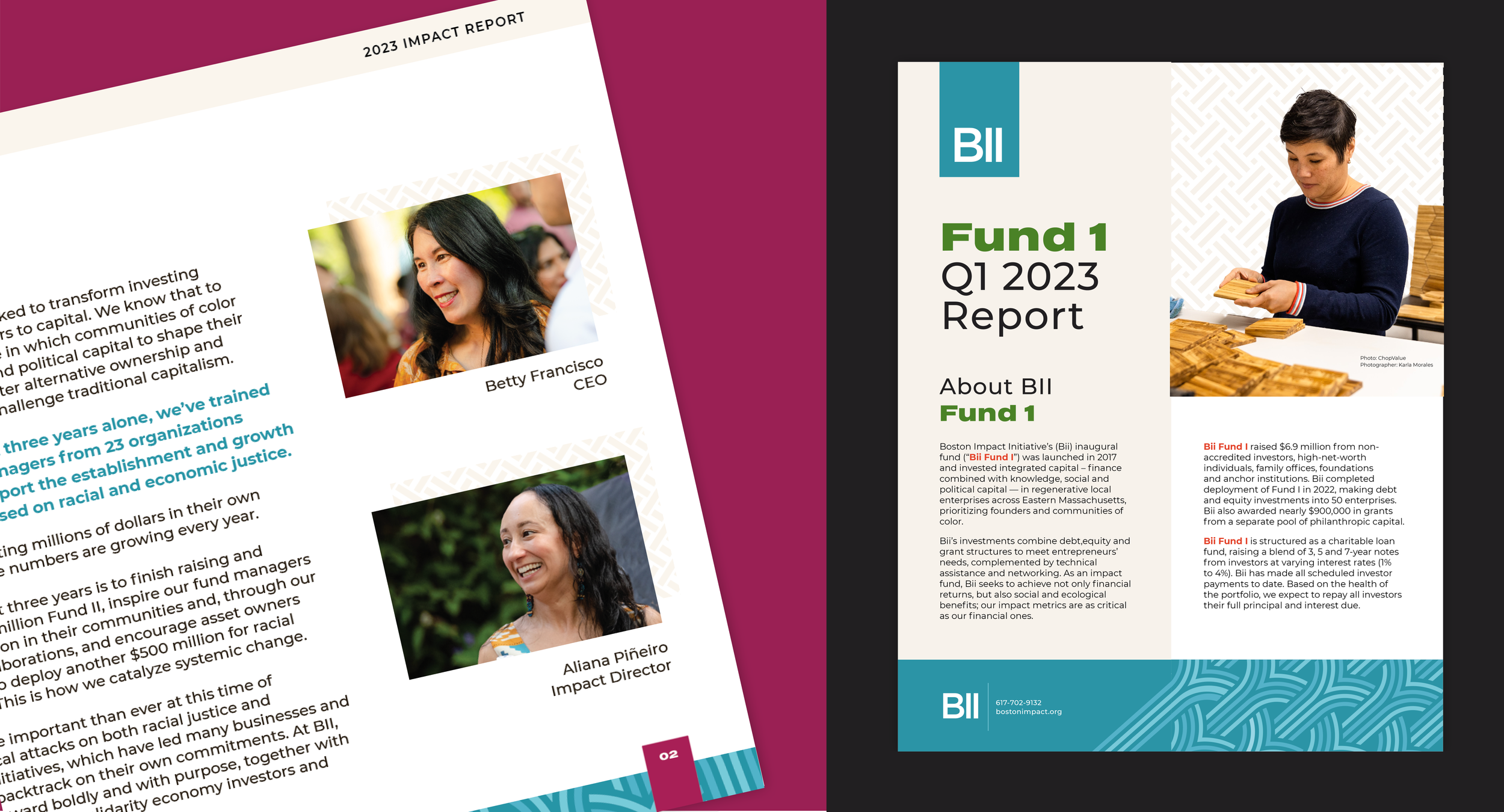
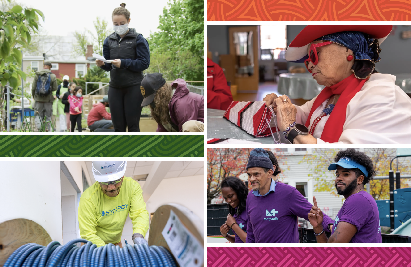
At DoodleDo, we believe in the power of authentic moments and real connections. Our design aimed to capture the essence of BII’s mission by highlighting the entrepreneurs and communities at the core of its efforts. $11.5 million invested across 67+ enterprises is impressive, but BII’s impact goes beyond funding businesses. Their commitment to closing the racial wealth gap, building lasting power in communities of color, and shaping a more just and equitable future is central to their work. Every investment BII makes is not just about financial support—it’s about driving change, empowering communities, and creating sustainable impact for generations. THIS the message our branding sought to communicate.
Color as Connection
The rich color palette used in our design evokes depth and complexity, symbolizing the strength and resilience of our communities. Each color, from Moss to Plum, carries its own significance, representing growth, stability, passion, and clarity. When layered, these colors create dynamic interactions, much like the diverse perspectives that unite to drive BII's mission. The colors reflect the vibrancy of their work in the solidarity economy, highlighting the interconnectedness that fuels collaboration and collective strength.

Interwoven Connection
Patterns inspired by the art of weaving serve as a powerful metaphor for the interconnectedness within our communities. Just as individual strands come together to form a cohesive fabric, BII's work in the solidarity economy unites people and groups in a shared vision of community development. These patterns symbolize the interdependence of diverse perspectives, experiences, and talents, highlighting the strength that emerges from collaboration and mutual support.
Threads that Extend Beyond
Allowing some threads to extend beyond the confines of the woven pattern was a deliberate design choice to bring energy and life to the overall aesthetic. These threads symbolize the fluidity of ideas and perspectives, pushing beyond conventional boundaries. This choice reflects BII’s core belief in encouraging individuality and innovation—inviting a “think outside the box” mindset that we sought to promote. It’s a visual representation of how diverse voices, when free to stretch and grow, come together to form a powerful, cohesive whole.


Team
Gisela Voss, Creative Director | Strategy & Voice/Copy
Sydney Voss-Kernan, Creative Director | Art Direction & Design


