
chica project
Since its inception, this incubator of minority powerhouse young women has served 2000 Chicas—with compelling, extraordinary mentorship stories and success rates. 99% of its young Women of Color graduate from high school and enroll in college. This needed to be celebrated and touted so that chica project can grow a full order of magnitude and explode into nationwide reach.
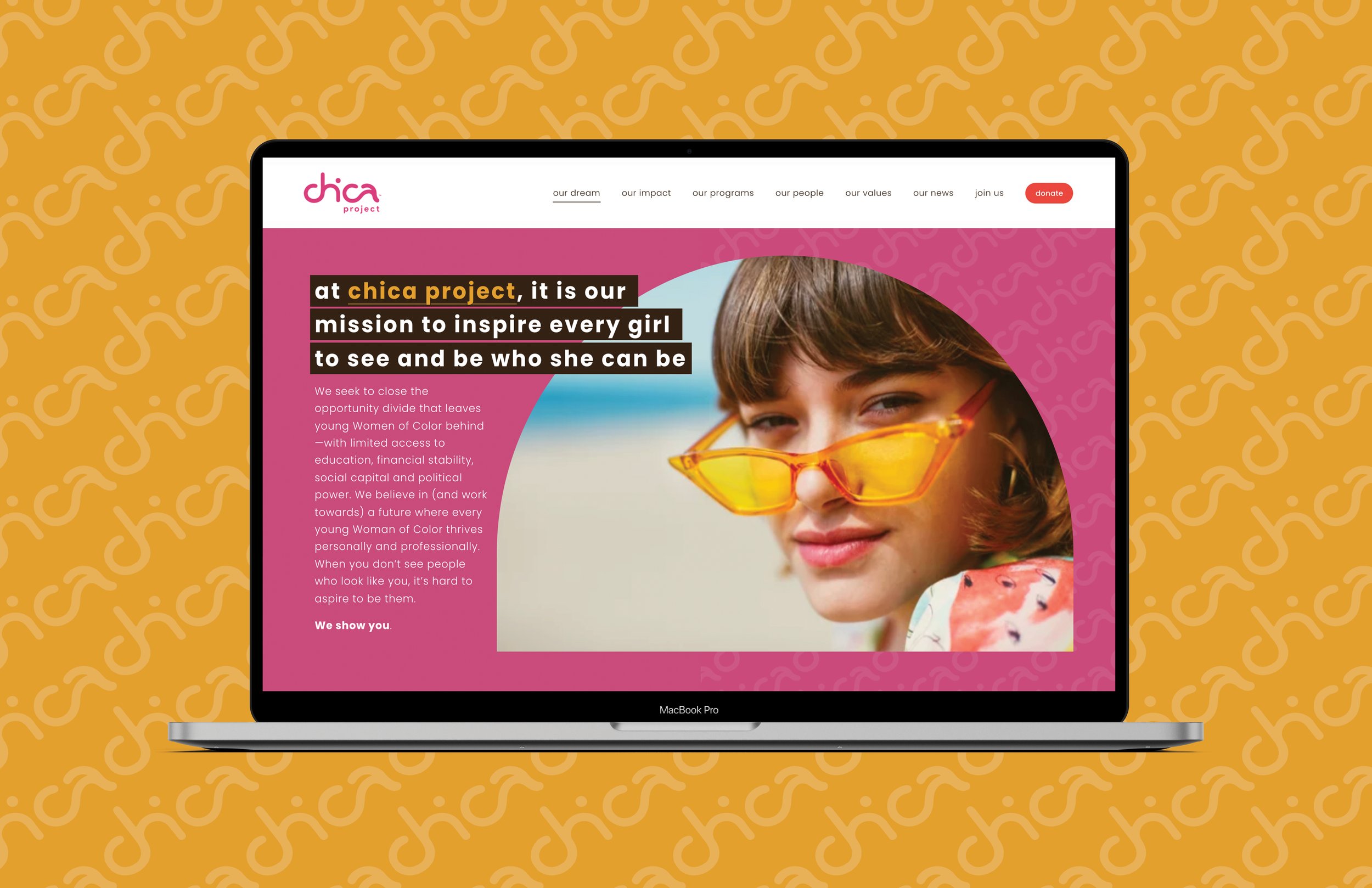
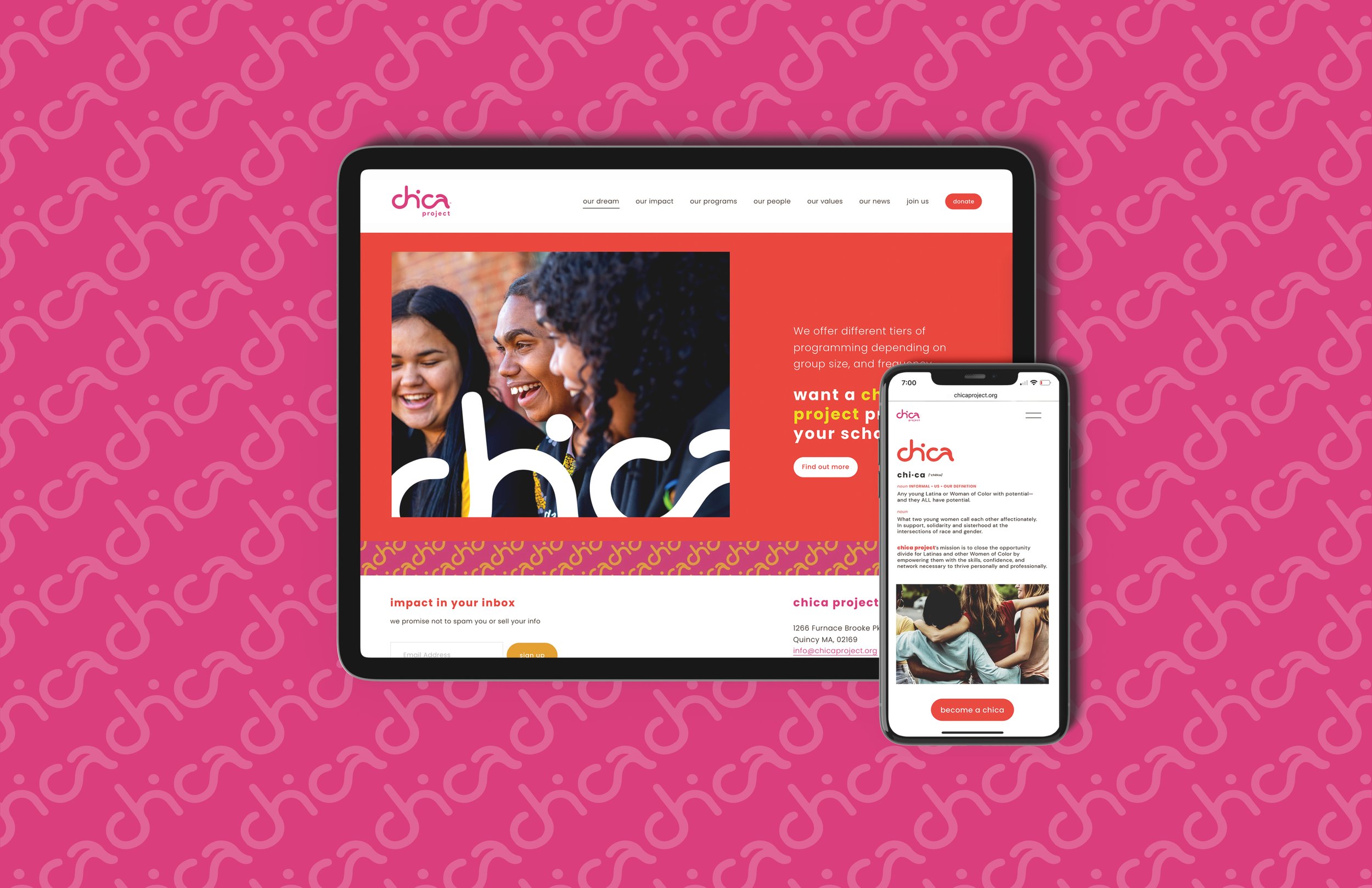
For the 10-year milestone of this important non-profit, we created a visually arresting, meaningful new brand with a bold new website and social media presence. A new sense of excitement, a playfulness and a confidence that reflect how confident chica project feels about their purpose—and the magic—of intergenerational relationships and diversity.
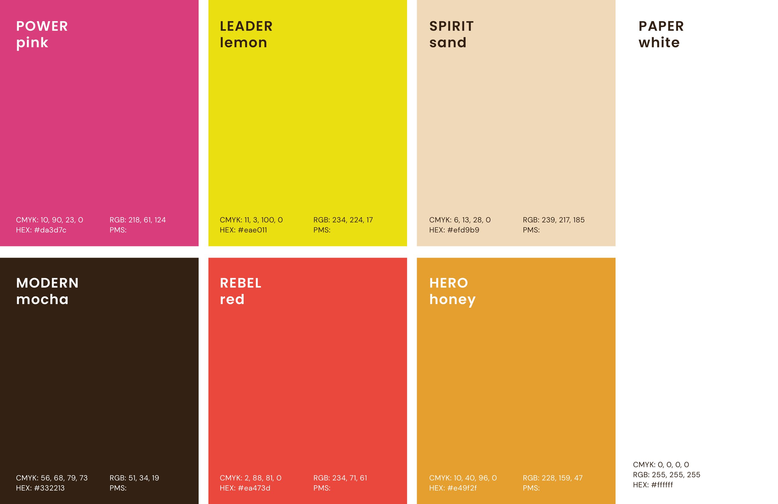
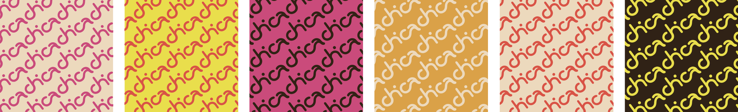
Color palette
We underpinned chica project with a trade dress designed to be fresh, modern and distinctive. Youthful yet sophisticated. Punchy and powerful. Colors with names that evoke all the things a chica is.
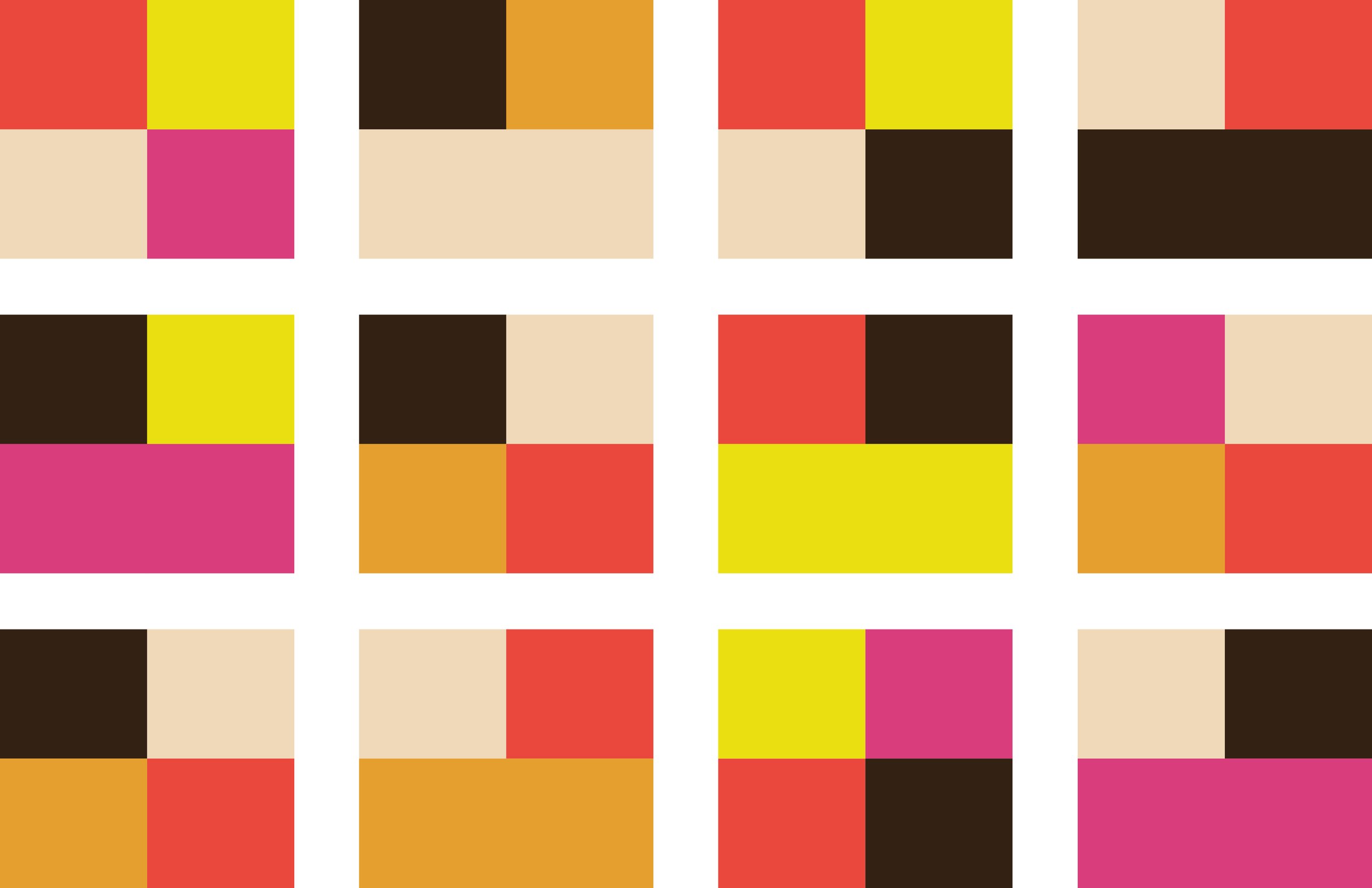
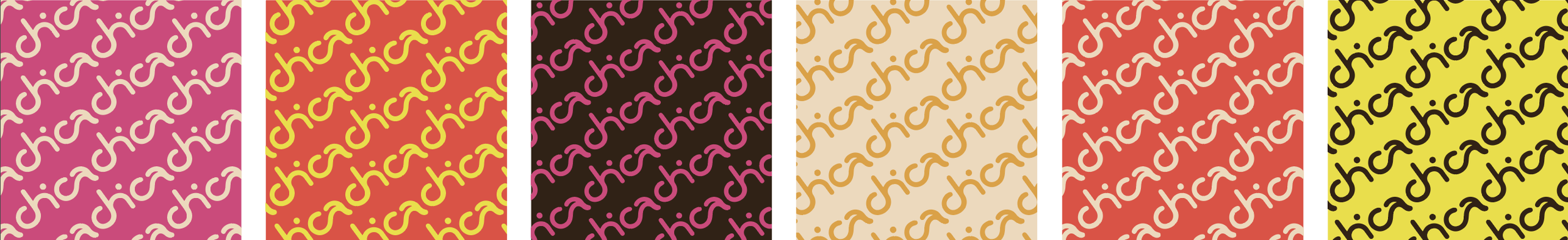
Color combos
Take in the eye candy our color palette can create. Different combinations can be adult elegant or playfully young. Juxtaposing our colors in these combinations creates an interplay of zest and pizzazz that will, over time, be instantly recognized as chica project.
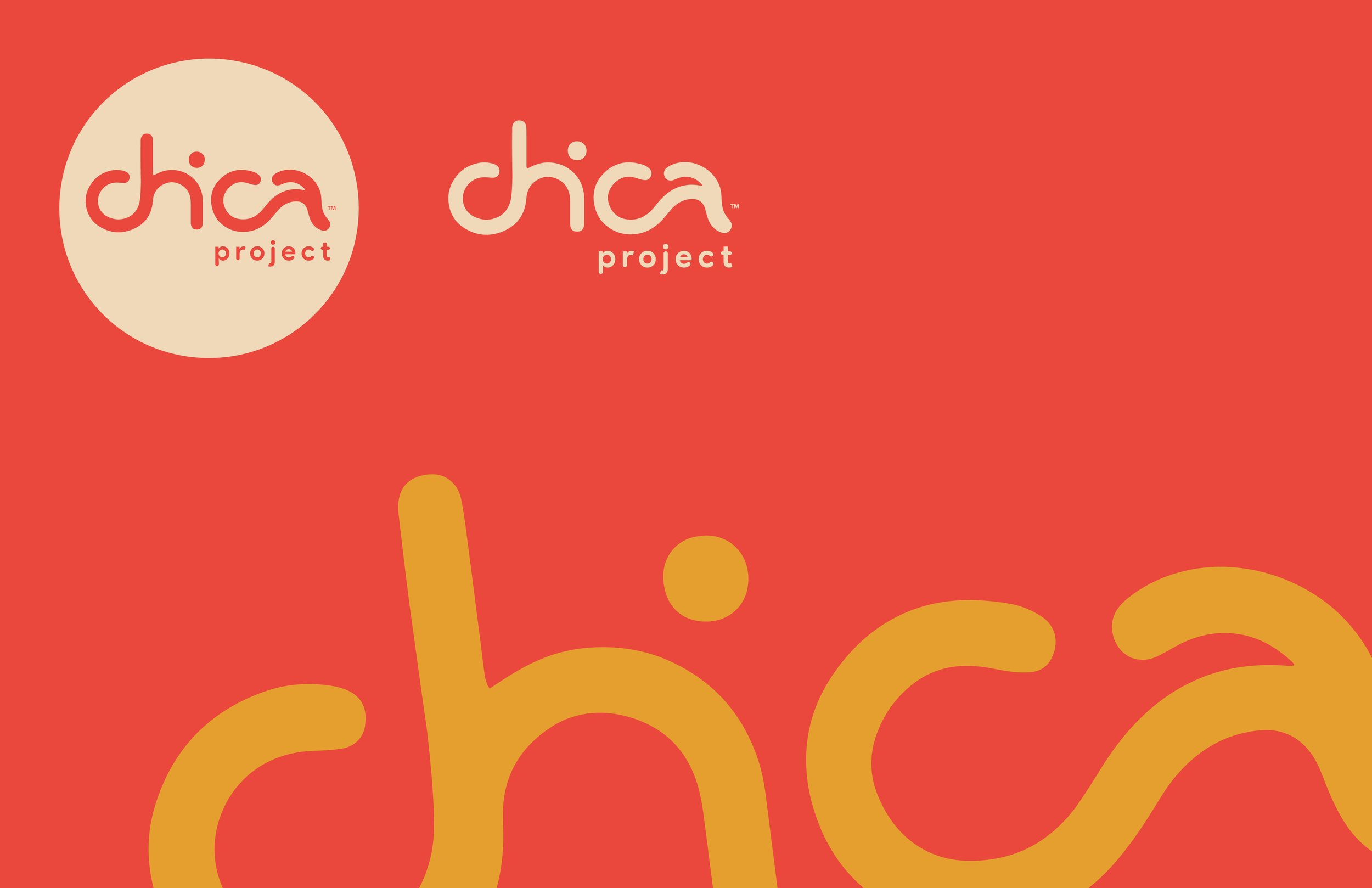
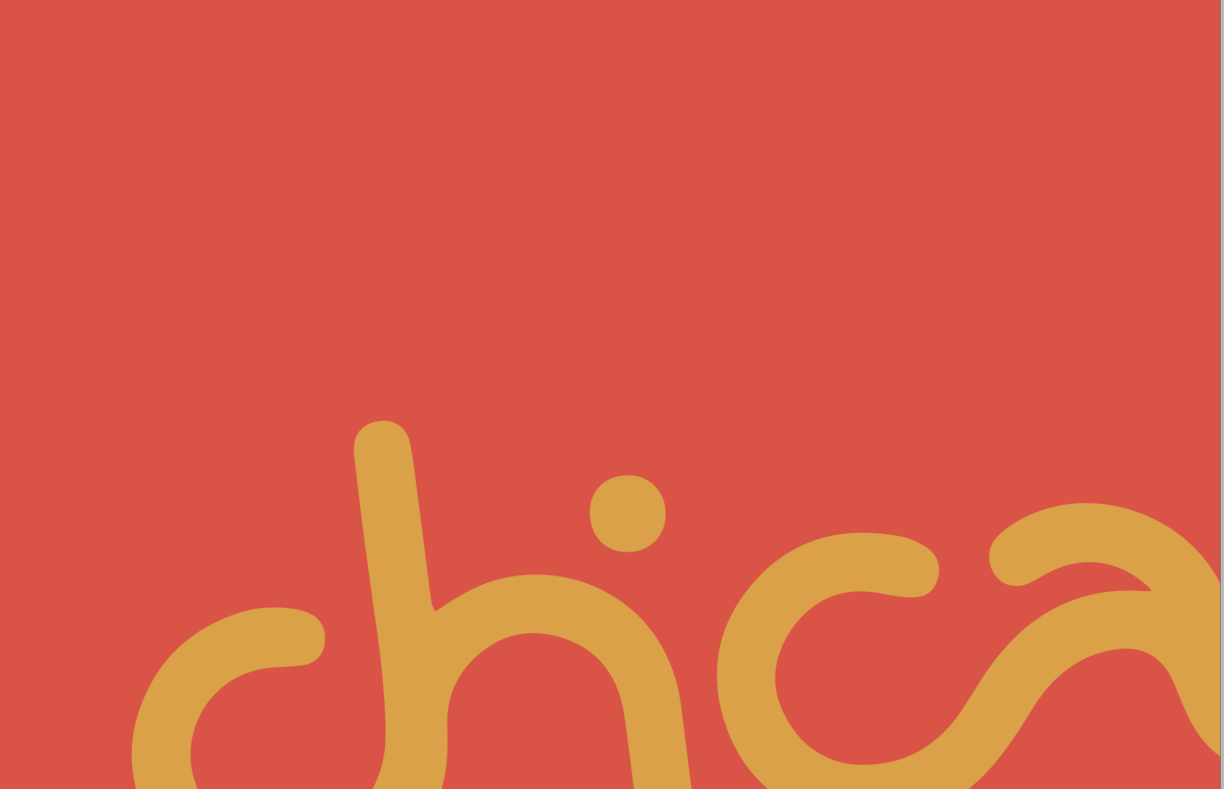
Free spirit logo
The hand-rendered logo calls out “chica” with curvy modern flair. We see a head in the dot of the letter i, perhaps a chica herself. In its basic form, the logo is contained within a circle. No beginning, no end, a symbol of infinite potential. Life trajectories aren’t linear, so one can always start on a new path at any point along the circle—each day a portal of possibility.
But in its tenth year, chica project no longer needs to always be bound by the safety of that circle. She can color outside the lines and set herself free.
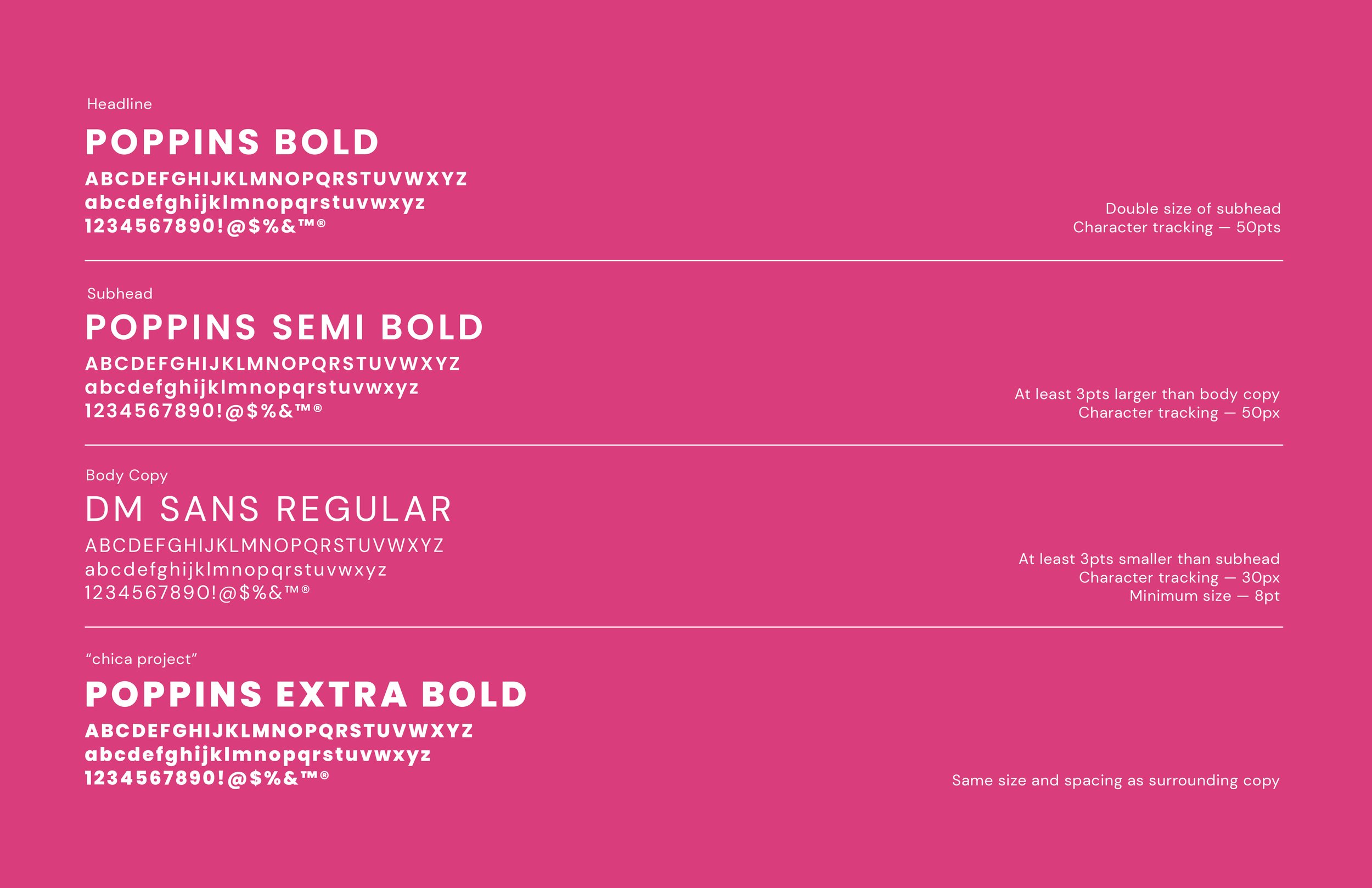
Typography
Geometric, modern, sans-serif fonts mirror the letters used in the chica project logo. Both Poppins and DM Sans have perfectly round o’s and a’s to emulate our logo letters. In both fonts, the dot above the lowercase letter i is a solid, perfect circle like the i in chica.
For body text, DM Sans has slightly more traditional lettering, which makes copy more legible. We wrote type rules for names, capitalization and character tracking.
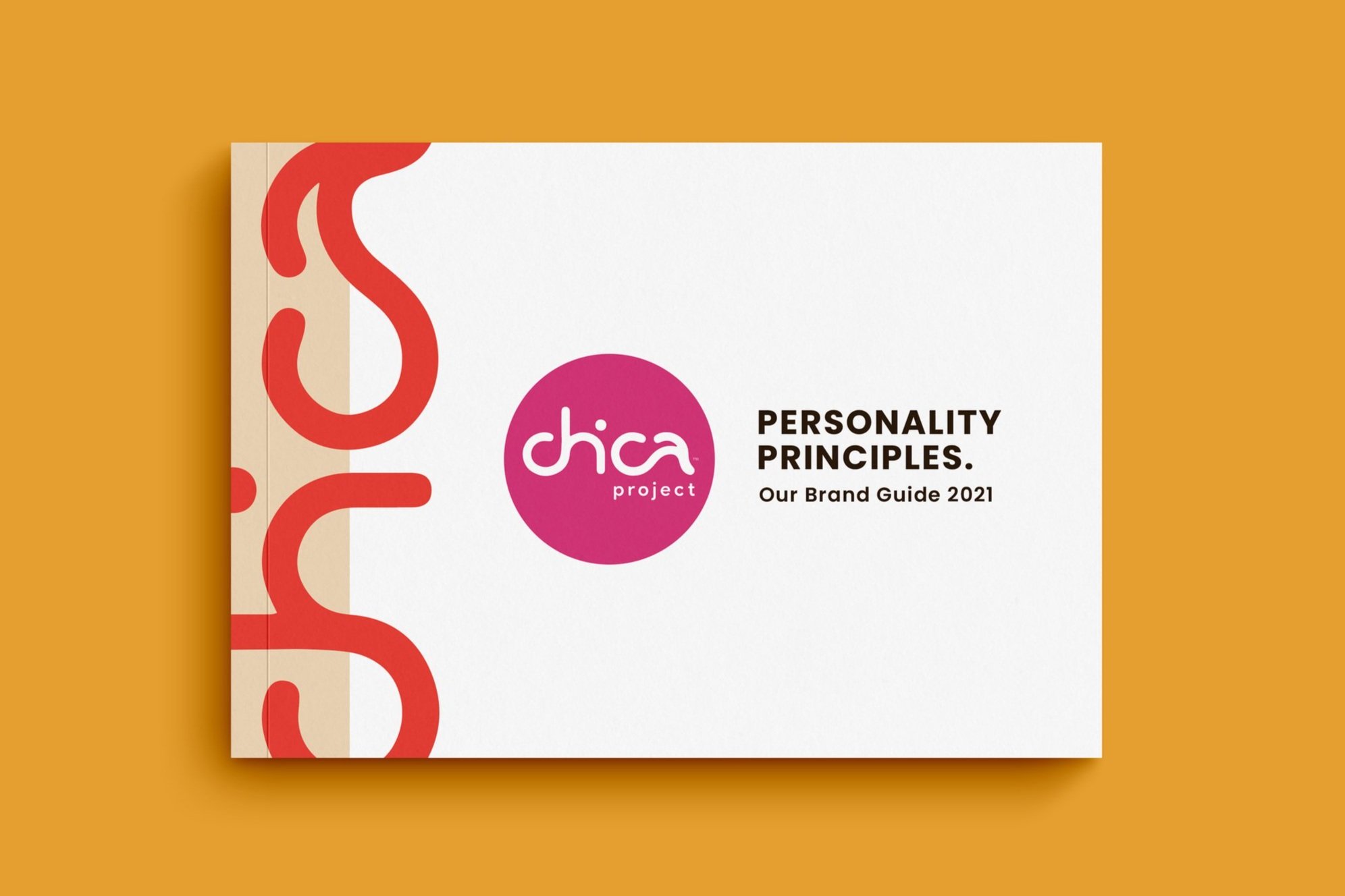
Personality principles
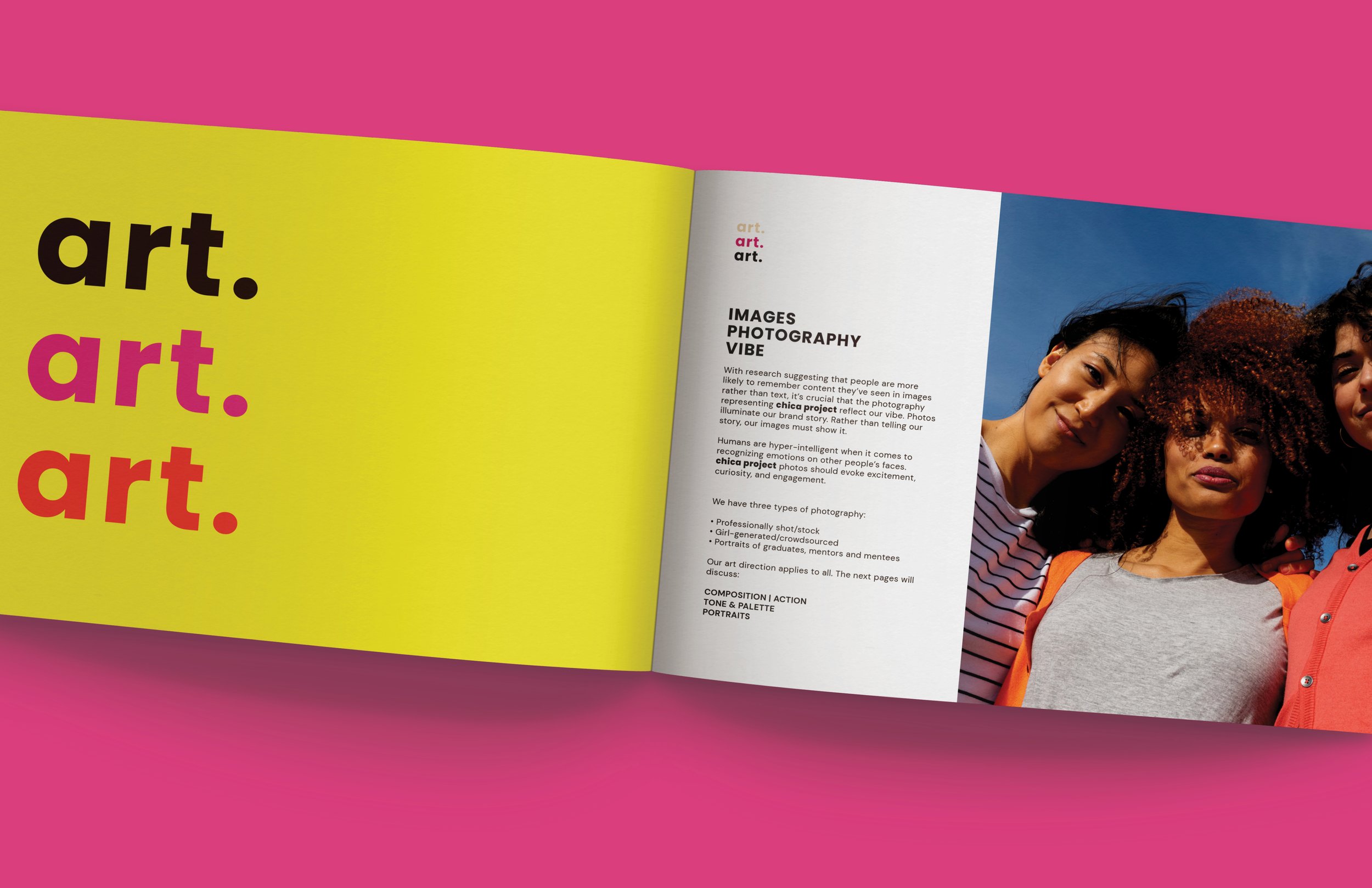
It’s tempting, we know, to bend the rules. But consistency ensures chica project is easily recognizable across all marketing channels and touchpoints. We wrote and designed a 50-page style guide so that everything from color to typography, voice and photography has a clear roadmap.
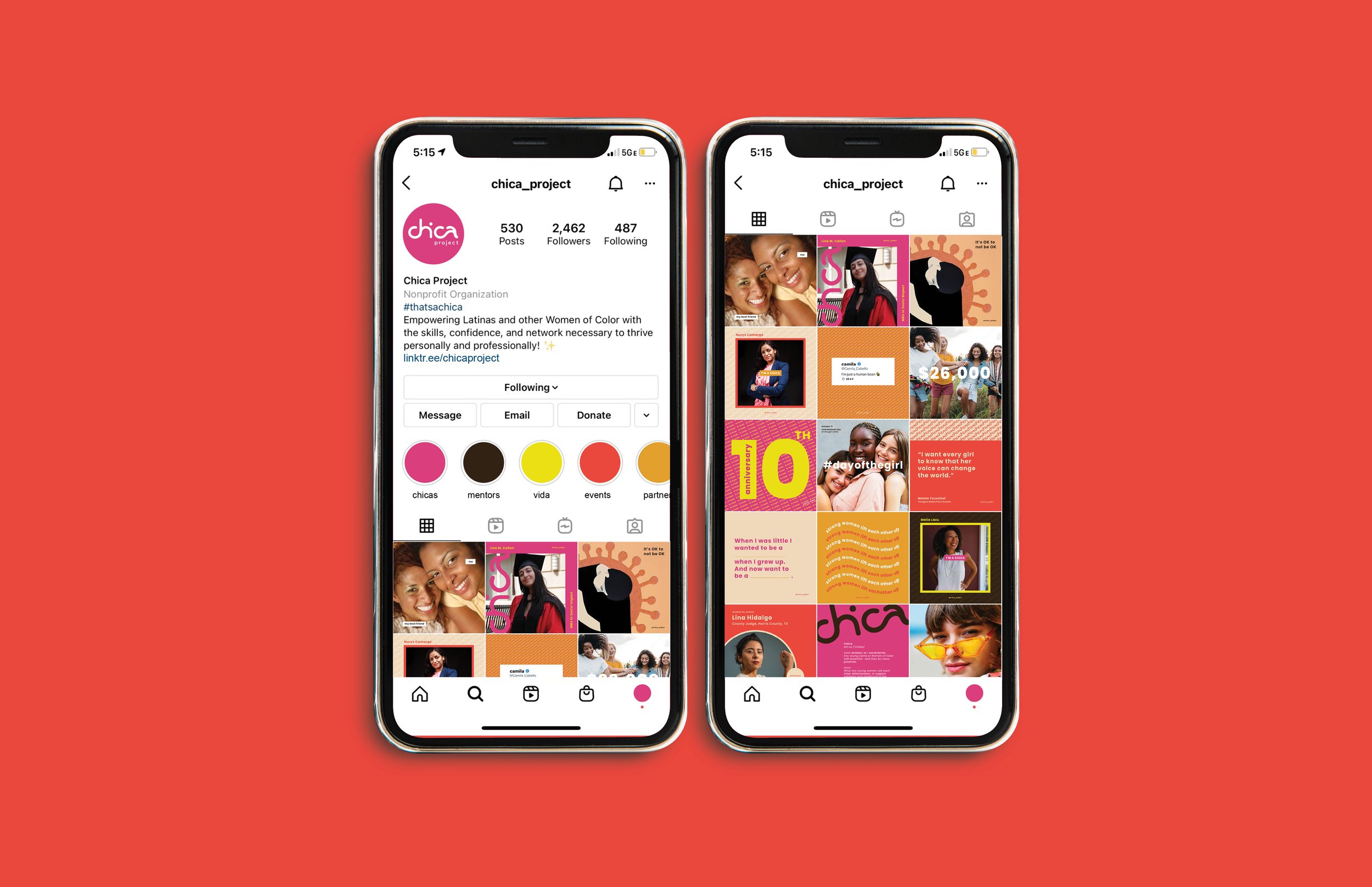
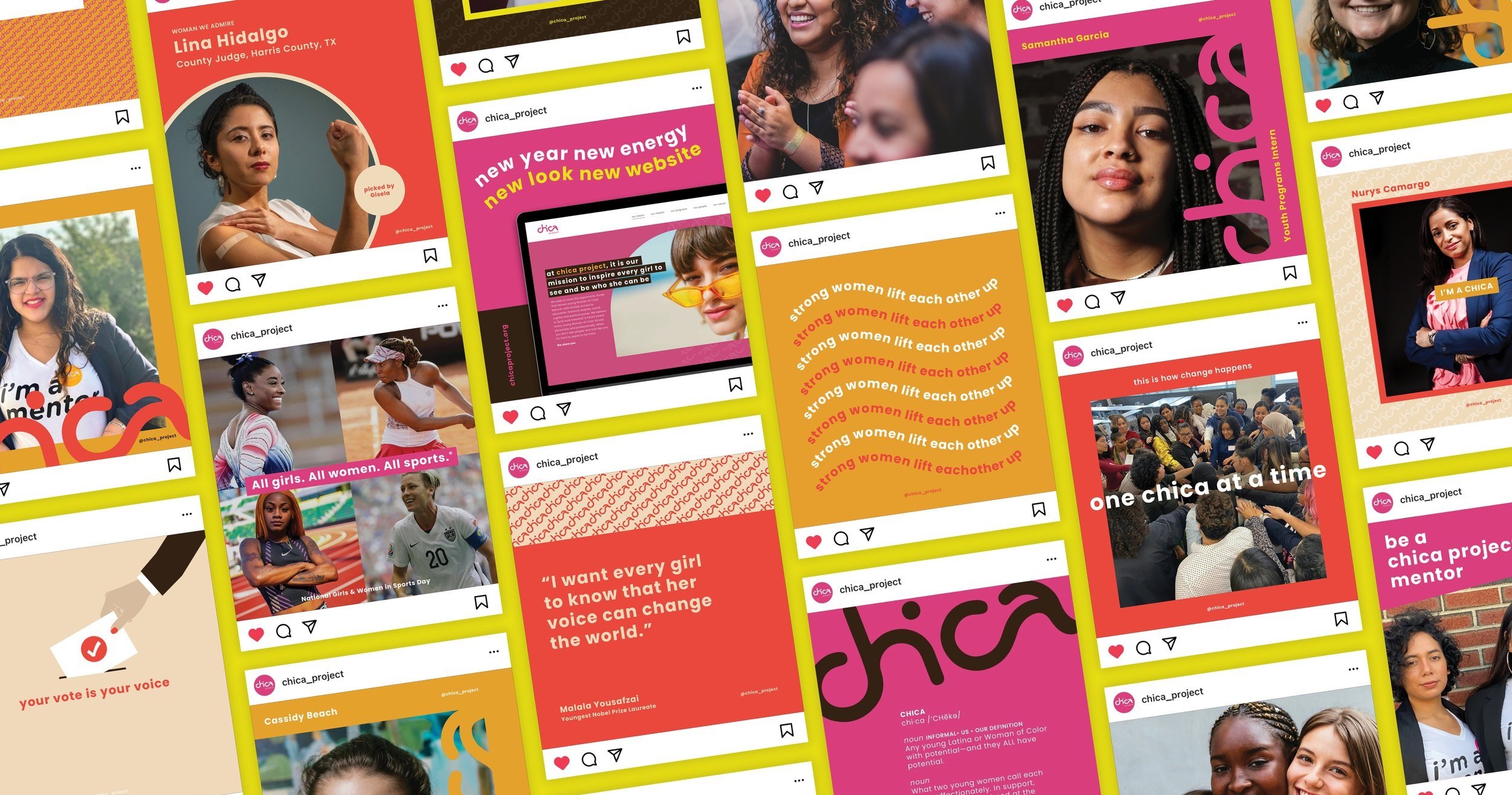
Social media
Followers are invited to join us in our mission to promote the voices of Girls and Women of Color. To grow its village and stand out in a sea of sameness, we created a narrative (and an Instagram feed) that makes the audience feel emotionally connected to the vision and vida that is #chicaproject.
Individually, we are one drop. Together, we are an ocean.
— Ryünosuke Akutagawa
Team
Gisela Voss, Creative Director | Strategy & Voice/Copy
Sydney Voss-Kernan, Creative Director | Art Direction & Web Design